
This blog has been created to act as your guide, to explain the rules and importance of a correctly designed logo. Before we delve into the design, let’s take a step back to look at why we use logos and the rules you should follow when creating one.
A logo is a representation of your company’s brand, characterised through shapes, colours, fonts and images. They’re used to identify and differentiate between other companies in the same market, so having one is really important as it makes your company recognisable and helps your brand stand out.
Before you start designing it’s important to consider these four steps…
1. Understand the brief – speak with your client, get to know their brand and what they want the logo to achieve
2. Research your competition – see what companies in the same market are doing already. How can you be different?
3. Sketch out concepts – sketch, scribble and sketch again. Develop your concepts, even the rubbish ones!
4. Reflect and revise then create and present – reflect on your designs, amend them and create presentable concepts
There are also certain rules you should follow when creating a logo design, but we feel if you stick to these four points, you’ll be off to a decent start!
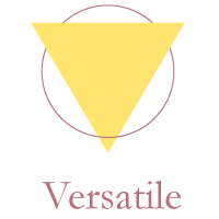
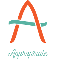
Keep it simple. A logo doesn’t have to be intricate, it needs to be recognisable. Think of the most iconic logos you can; Nike, McDonalds, Apple…they are all simple shapes that are identifiable even when there’s no text to accompany them.

The design needs to be striking and stick in people’s minds. Make it different from anything already out there, but not so different that people should analyse it in-depth to understand it.
Logos are not solely used in one medium, they appear on different devices across social media and the internet as well as print. Your logo must be designed with this in mind – it must translate/transfer from paper to screen and vice-versa. The size is also vital. It needs to be scalable from use on a business card, right up to a billboard.
You must understand what your logo is representing and how it reflects the business. A logo inspires trust and creates an identity, so staying appropriate to your brand is key.
If you’re looking for a more visual example of logo design, these three images point out the good, the bad and the ugly – so you know what to avoid!
![]()
Good – Clear company name and strap line. Corporate colours and font. Ample spacing. High resolution. Scalable.
![]()
Bad – Too many fonts. Doesn’t flow. A lot of information.
![]()
Ugly – Not relevant. Outdated. Poor layout. Poor use of colours. Low resolution.
Overall, don’t rush your design, do your research and be patient! It will be worth it in the long run and your business will have great first impression from the get go. We have worked on various logo designs for start-up businesses as well as re-brands for existing companies, so we would love to have a chat with you and share our advice. *Coffee and doughnuts included*. Drop us a line if you would like to know more about logo design enquiries@visualprint.co.uk.
We'd love to help you with your next print or design project.
If you would like to speak to our team, simply call us on 01522 300222.