When it comes to your business stationery, first impressions count. Having a consistent design across all your stationery essentials ensures strong corporate identity and professionalism. It lets your customers know that you care about your reputation!
We often get asked ‘what makes a good letterhead design?’, so some of the team have laid out their top tips for creating a business stationery pack with an edge.
Charlotte – Keeping the design consistent across the whole pack is key. Your letterhead, compliment slips and business cards need to look like they are part of a set. This can be done by using the same logos, fonts and colours.
Scott – Ask for professional advice, especially if it’s your first time! There’s no point investing your time and money into something that you will not be 100% happy with once it’s printed.
Sophie – As we always say, keep it simple! The overall design should be apparent, but not overpowering. You don’t want to detract away from the actual message and content of your letter.
Charmaine – Think about how your business stationery will be finished, trimmed and folded. The letterhead will be folded and inserted into an envelope, you don’t want important information on the fold line.
Hayley – Mix things up with finishes. Foiling looks great on business stationery for that luxurious appeal that your competitors won’t have!
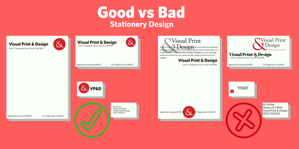
Sound like good advice? We hope so! But if you need a little more help on how to do things right, here’s a visual example of good and bad stationery design. Make sure yours is done correct!
We'd love to help you with your next print or design project.
Alternatively, if you would prefer to speak to our team, simply call us on 01522 300222.