Choosing the right font for your business is the crucial. You’ve got the brand name, meaningful tagline and brand colours – now you need to select the perfect font to complete and compliment your brand identity.
We respond to fonts in an emotional way, similarly to how we respond to colours. They can make us feel trust, anger, respect and happiness. Fonts also influence how we read or feel about certain information.
The choice of font is important as it will instantly say a lot about your business, often without you even realising. The right font will help spread your company message and make it resonate with your target audience. The wrong font can damage company credibility and turn potential clients away.
Here’s 5 elements you need to consider when choosing the right font for your business.
What are your brands qualities? What do you represent and what’s the message you want to convey? It may be that you’re trustworthy, fun, corporate or modern. Knowing how and what you want to communicate to your target audience will help when selecting a font.
The aim of ‘branding’ is to be unique and position your company apart from competitors. Fonts can help to add personality and character to a business.
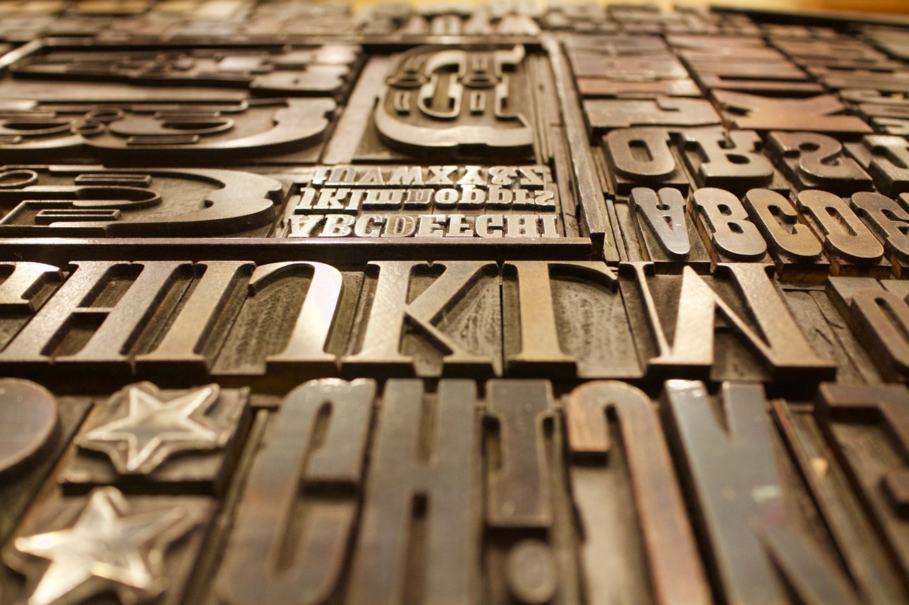
There’s a range of different categories that fonts fall into. Here’s a selection to get you started:

Serif fonts are traditional and classic. They convey authority, trust and respectability. Large companies that use Serif fonts include Honda, HSBC and Dior . Serif fonts are commonly used to print and the letters flow together making the copy easier to read.

Sans-serif fonts are soft and curved. They work better on screen and have a modern, simple and clean feel to them. Companies such as Amazon, Nestle and Walmart all use Sans-serif fonts.

Script fonts look handwritten and feel elegant, feminine, creative and friendly. These fonts are not ideal for body copy as they become less legible when used in paragraphs.

Novelty fonts are useful for one off pieces of content, but we wouldn’t recommend using them as a business font. They are often comical, fun and bold. The longevity of novelty fonts is low as they normally follow trends that last a few months or year.
Once you’ve selected the perfect font, make sure the sizing is correct. Too big and it will appear you are shouting to get noticed. Too small and text will be illegible. You want a ‘just right’ approach. Anywhere between 12pt – 8pt is perfect for body copy, and 40pt – 20pt for headings and subheadings.
Incorporating brand colours into font is a great way to hit a well-rounded brand experience. However, it’s important the font remains legible when colour is added.
Choosing the right font for your business is essential for building strong brand identity and creating a positive first impression. It can be difficult and often overwhelming at first, but as long as you follow our advice and have your brands purpose at the front of your mind, you’ll choose the right font in no time.
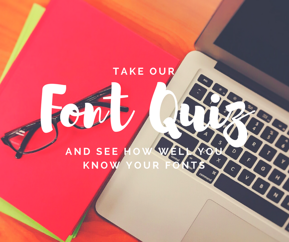
Now you've read our blog, why not test your new found knowledge by taking our font quiz! Don't forget to share you score with us.
We'd love to help you with your next print or design project.
If you would like to speak to our team, simply call us on 01522 300222.