Our top tips for designing for large format print
Whether you’re designing graphics for a fabric exhibition stand, outdoor banner or even for signage, your designs must stand out from the crowd as well be prepared correctly for large format printing. That’s because typical design rules and guidelines that may apply to your standard business cards and leaflets might not be relevant when designing for large format.
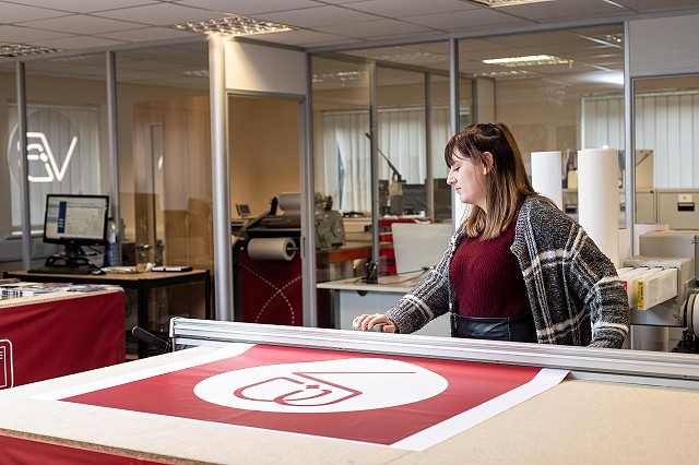
For over 10 years we’ve been designing and printing large format items for businesses all across the UK so to make it easier for you, we’ve put together our top tips:
Keep it simple
The aim is to communicate a specific message and while you’ll have a large space to use, that does not mean that you should try and cram as much information on it as possible. You need to carefully plan how you want to convey your message and ensure the most important information is in the consumer’s eye line.
Scaling
To keep your file size smaller (and to prevent your computer from having a meltdown!), it is advisable to have your design at 25% of the finished size.
Use high-quality images and graphics
All images need to be a high resolution of at least 300dpi and if you’re using graphics such as your logo, the best format to have them in for large scale graphics is an EPS vector. That is because an EPS vector file can be scaled up dramatically but will still maintain its original clarity so it won’t become pixelated.
Be careful with fonts
As the majority of large-scale graphics needs to be viewed from a distance, you need to pick fonts that not only fit your branding and message but also are easy to read. Some script style and serif fonts can have readability challenges. That’s why you need to test out font before sending it to print by reading the text from a distance and having another pair of eyes look over it.
RGB vs CMYK
While RGB (Red, Green, Blue) has its benefits in creating vibrant colours, it is for screen use only and can’t be printed whilst CMYK (cyan, magenta, yellow, key) is what the printers use. By using CMYK as default when design graphics for print, it ensures that your colours will be more accurate. Like with font, you must pick colours that contrast well with any text and graphics and complement your brand as a whole.
Don’t forget the bleed
While this can differ depending on what type of large format item, as a rule, it’s good to have at least a 5mm bleed around the edge of your artwork.
Leave it to the experts
As a team of highly skilled Graphic Designers, we know what is going to stand out and over the last 10 years, we have built a reputation for developing brands and designs that add value to companies all across the UK.
From exhibition stands and displays boards to outdoor and internal signage, we can help you make a big impression with our range of large format printing solutions. Talk to us today about your design and print requirements.