What is the Golden Ratio?
Did you know there is a mathematical ratio found in man-made designs? Who knew design was so geeky…? (Actually, we did)
When used properly, they can help create aesthetically pleasing compositions. It is something that has been recognised for thousands of centuries – from the pyramids in Giza and Da Vinci’s Mona Lisa to the Pepsi logo.
So let’s talk Golden Ratio…
What is the golden ratio?
We will try and explain this in its simplest terms as it is all to do with maths (my head hurts already!)
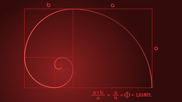
The Golden ratio exists when a line is divided into two parts and the longer part (a) divided by the smaller part (b) is equal to the sum of (a) + (b) divided by (a), which are both equal to 1.618.
The golden ratio is about 1.618 and is represented by the Greek letter phi.
But what has this got to do with graphic design you ask?
Well, the golden ratio all boils down to aesthetics and visually pleasing designs. Most graphic designers are familiar with the grid system and rule of thirds as it creates well-structured and visually pleasing layouts. There are a few versions of the Golden ratio which can be used with graphic design. These included the Fibonacci Spiral, the Golden Ratio Circles and the Golden Spiral.
How to apply the golden ratio to graphic design
You can apply the golden ratio to many compositional elements such as typography, image composition, logos and layouts.
When using the golden ratio with typography hierarchy, it is all about the size of your text. For example, if your smallest font is 10px, multiply that by 1.618 and you get a rough guide for your larger text sizes.
Image Composition should be applied to the Golden Spiral – overlay the spiral onto your images to see which elements should be positioned where.
When you use the golden ratio within logo design, it should draw people in. Some of the biggest brands using this method, including Pepsi, Apple and Twitter.
With Layouts, it is helpful to use the golden spiral to guide the placements of each element. Humans are naturally drawn to the centre of the spiral, making it vital to place the most important message there.
Why is Golden Ratio important?
Our brains are seemingly hard-wired to prefer objects and images that use the Golden Ratio, it is a subconscious attraction that has an impact on our brains.
The composition of any image is important – whether it is to convey important information or to create an aesthetically pleasing visual.
Whatever the message is on your marketing communications, making it easy to read and visually pleasing the consumer is vital.
Are you still finding this all a bit too mind-boggling?
Let our award-winning graphic design team help you with your next design project – get in touch via email or give us a call on 01522 300222.